
Corporate Identity
Karasev Studio delivers corporate identity solutions that are 100% unique and tailored to your business. We work with you to crystallize what differentiates your business; its core values, essence and personality. Our interdisciplinary skill set ensures your business identity and logo avoid the Seven Cardinal Sins of Logo Design.- Effort, subject matter expertise, and a cultural background to understand the client and their business, what it stands for, and its personality.
- Creative ability to convey the essence of the client's business graphically - uniquely, succinctly, and tastefully.
- Fundamental understanding of typography, the emotions that different typefaces evoke and why.
- Knowledge of the color theory and appreciation of how different colors work and what feelings they create.
- Creativity and experience making positive and negative spaces communicate in a clear and deliberate fashion.
- Knowledge of the prior art.
- Courage to pare down or "undress" the brand to its bare essence.
- Courage or expertise to advise the business on brand naming.
NoHo Dental
An identity upgrade for a premier dental practice.| Dr. Stanton E. Young, who runs NoHo Dental, one of Manhattan's leading dental practices, is having Karasev Studio provide
an upgraded identity and web site that reflect the caliber of his work and client service.
While the new web site is in progress, the logo is ready. We selected a sophisticated yet modern and clean serif typeface, and tailored it uniquely to the client, creating a custom "ND" ligature. A molar outline serving as the opening in the letter D completes the design. |
|---|
InstaMedCare
An upscale medical urgent care clinic needed an identity, fast.| Before Karasev Studio's involvement: This client came to us with an urgent need: they have just opened for business, but so generic was their logo that there was already a copyright infringement claim against it. They needed a designer on whom they could count to create completely original work, and hence reached out to us. |  |
|---|---|
| In order to get an accurate feel for the client's environment and personality, we visited InstantMEDCare. Their office
is very bright and modern and dynamic, and green plants are everywhere, hearty and lush.
Alex Karasev selected a green color scheme that fit the look of the office and its personality, in a complete departure from their former red cross design. The brand message, therefore is, "InstaMedCare is a dynamic and bright place where patients come to get better, to regain their vitality." Alex Karasev has sketched several logo variants, combining leaves and medical symbols. | |
| Design #4 (top-left on the previous image) was selected (flipped left to right).
The green leaf represents youth and vitality. The cross punched out inside gives a nod to the client's prior identity and the medical field. Karasev Studio also proposed a name change from InstantMEDCare to InstaMedCare, which the client accepted. | |
| Outdoor-facing posters (see the "before", top image) were upgraded to digital signage, whose back-lit and dynamic nature allowed to make them
smaller without loss of attention.
We re-focused the message on the glass from contact information (see top image) to value provided to the client, reducing the font and lowering the placement. In tandem with the signage changes, this allowed the office's welcoming interior, now much better revealed, to speak for itself. Switching to LED bulbs allowed to keep the front area lit at all hours, while still providing net energy and cost savings. | 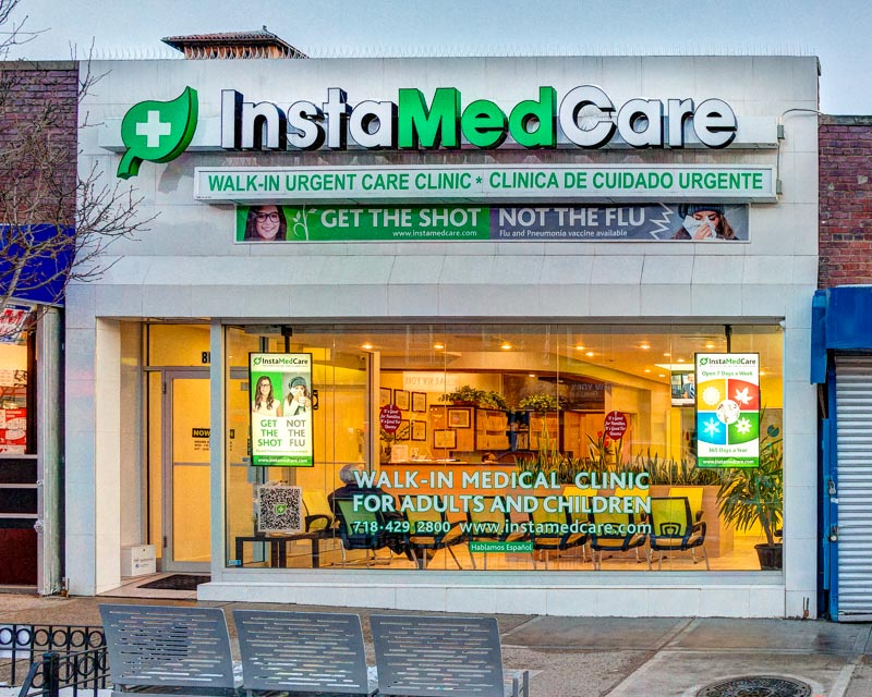 |
| On the strength of these improvements, the client asked Karasev Studio to design doctor and nurse uniforms.
We continued with the vitality message and the green palette. Photo by Alex Karasev. |  |
| The uniform is featured in a greater detail on this doctor's headshot.
Karasev Studio delivered high quality photography for the client's web site and printed materials. In designing the site, we used actual colors and textures from the office for backgrounds of the web site's visual elements. In addition to colors and a responsive mobile-friendly / mobile-optimized site design, Karasev Studio created advertising jingles (home page, top) and advised on other aspects of the web site's copy. |  |
| Decorative pins for special occasions and unbranded garments help spread the brand message. | |
| Bus stop advertisement, although pricey, can deliver a great value to a local business, because people waiting for a bus are
a captive audience.
Needless to say, in this age of smartphones and a myriad of other distractions, the design and the message have to be compelling; otherwise, that investment is wasted. Client needed an arresting idea or a call to action that people would remember and associate with the InstaMedCare urgent care clinic. Alex Karasev came up with "ENOUGH WAITING." This poster design features a Green Wave concept and design pattern we created and articulated for InstaMedCare to use in all media (see the next image). | 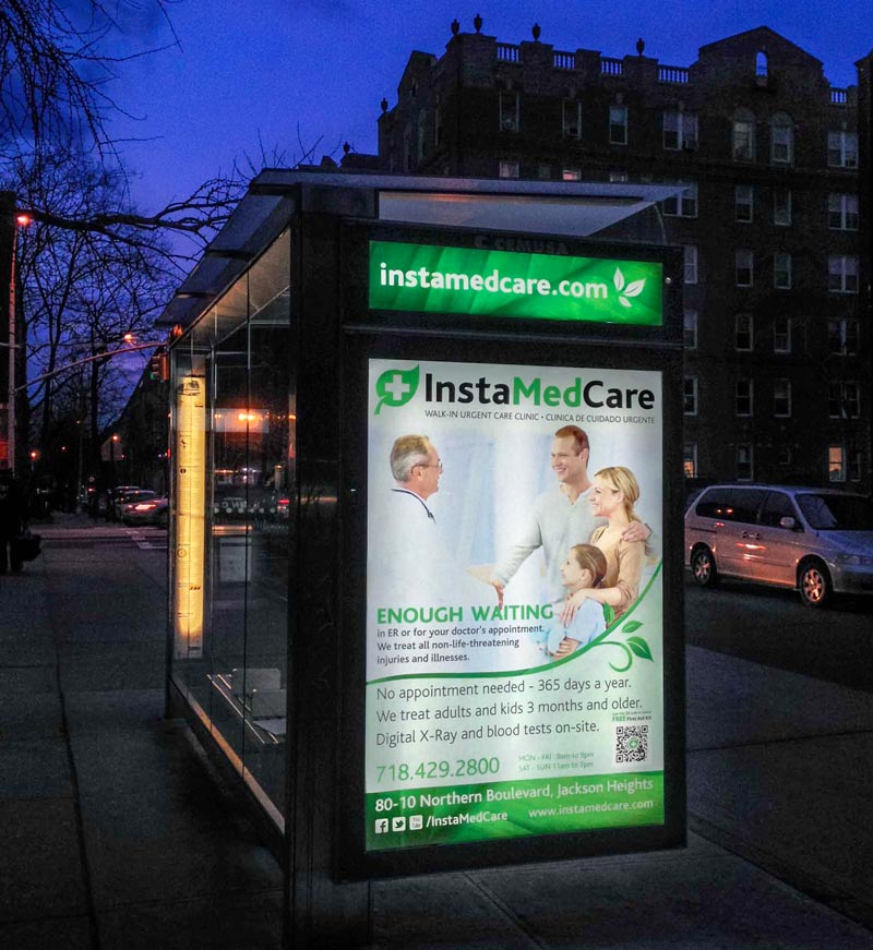 |
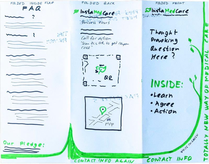
| Bifold brochure concept delivered by Karasev Studio. Our Green Wave concept:
Metaphor: A Green Wave is sweeping through. It represents an unstoppable march of youth, health, vitality. InstaMedCare is that wave.
|  |
| Finished brochure, outside. | 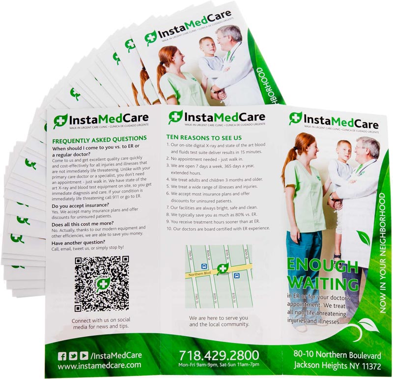 |
ALEX NIN
Timeless elegance.An upscale European bespoke jewelry maker approached us for a logo for their new retail brand. While the brand was new, it had to
reflect their taste and experience honed over decades of work for up-market individual clients. Our solution:
| |
|---|---|
| A horizontal logo version, spelling out the company name. | |
| End result / an example of logo use: jewelry box. |
VOLNAX
Taking cues from a cultural heritage.| For this Russian client, we dove into the rich depths of his ethnic culture. Transliterated in Russian, VOLNAX spells "[on] the waves."
Therefore, for the color palette, those well-versed in the culture in question will understand why, inevitably, we sought inspiration among the works of Ivan Konstantinovich Aivazovsky. Portraying in a stunning fidelity the turbulent seas' many moods, was his entire life's work. We took the colors for the logo from his iconic Ship on Stormy Seas (1858). | 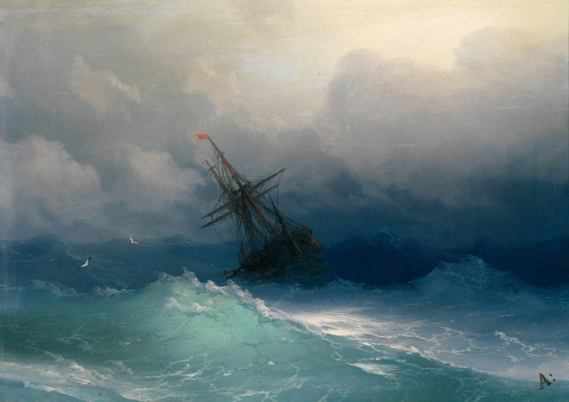 |
|---|---|
| Square icon for the mobile apps and other square-format uses. | |
| Horizontal logo version, spelling out the company name. | |
| Karasev Studio designed and delivered a broad array of marketing materials for the client, including brochures, business cards (complete with custom cases), mail pieces (including concept and advertising copy), letterheads and document templates, and even an applet that automatically generated machine-readable QR code stickers for the company's assets. | 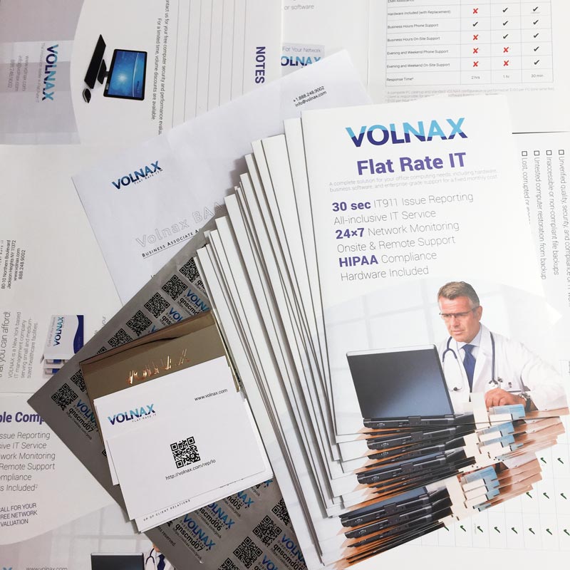 |
| VOLNAX sounding as a medicine name to an American/English ear is utilized in this digital package rendering. | 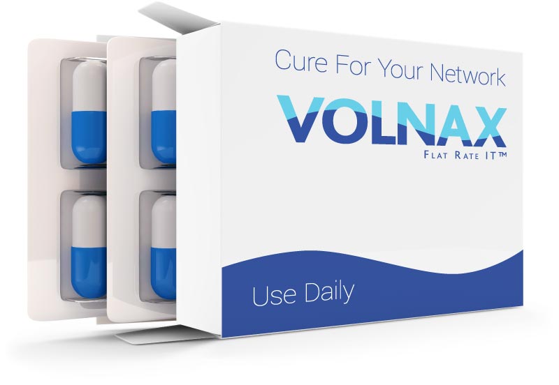 |
Self
We redesigned our logo in preparation to release several of our in-house tools as mobile apps helping photographers, directors, and location scouts.| The new Karasev Studio logo shows use of negative space, where the punched-out letter "S" for "studio" is serving a double-duty, turning a stylized camera silhouette into a letter K for "Karasev".
In a logo, succinctness is vital, and a good design will seek to say more with less. |
|---|